brief
details
We needed to have a distinctive Simba photography style.
Our imagery needed to serve multiple purposes: primarily for our website but also for press releases, social media, product-led banners and print materials.
Product images had to stand alone as tasteful pieces, instantly recognisable as Simba's. User research highlighted the importance of showcasing emotional benefits in our visuals.
We aimed for three key qualities in our imagery:
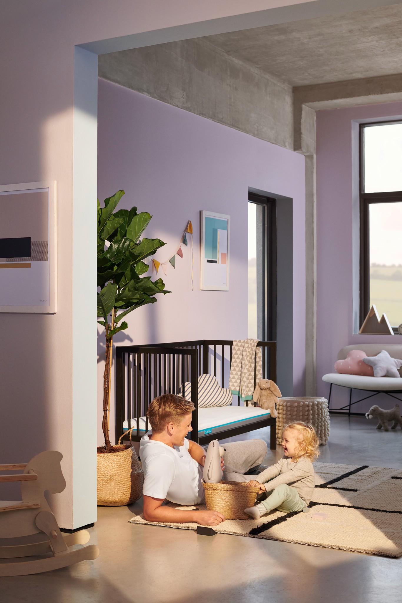
Aspirational: Thrive after a good night’s sleep on a Simba mattress.
Empowering: The journey it takes to become the best version of yourself.
Relatable: Emotional scenarios that reflect both everyday challenges and significant life moments.
This approach ensured our photography resonated with our audience while maintaining a cohesive brand identity across all platforms.
concept
photo and video art direction
shoot organisation
ui design
paid social ad designs
email designs
Concept
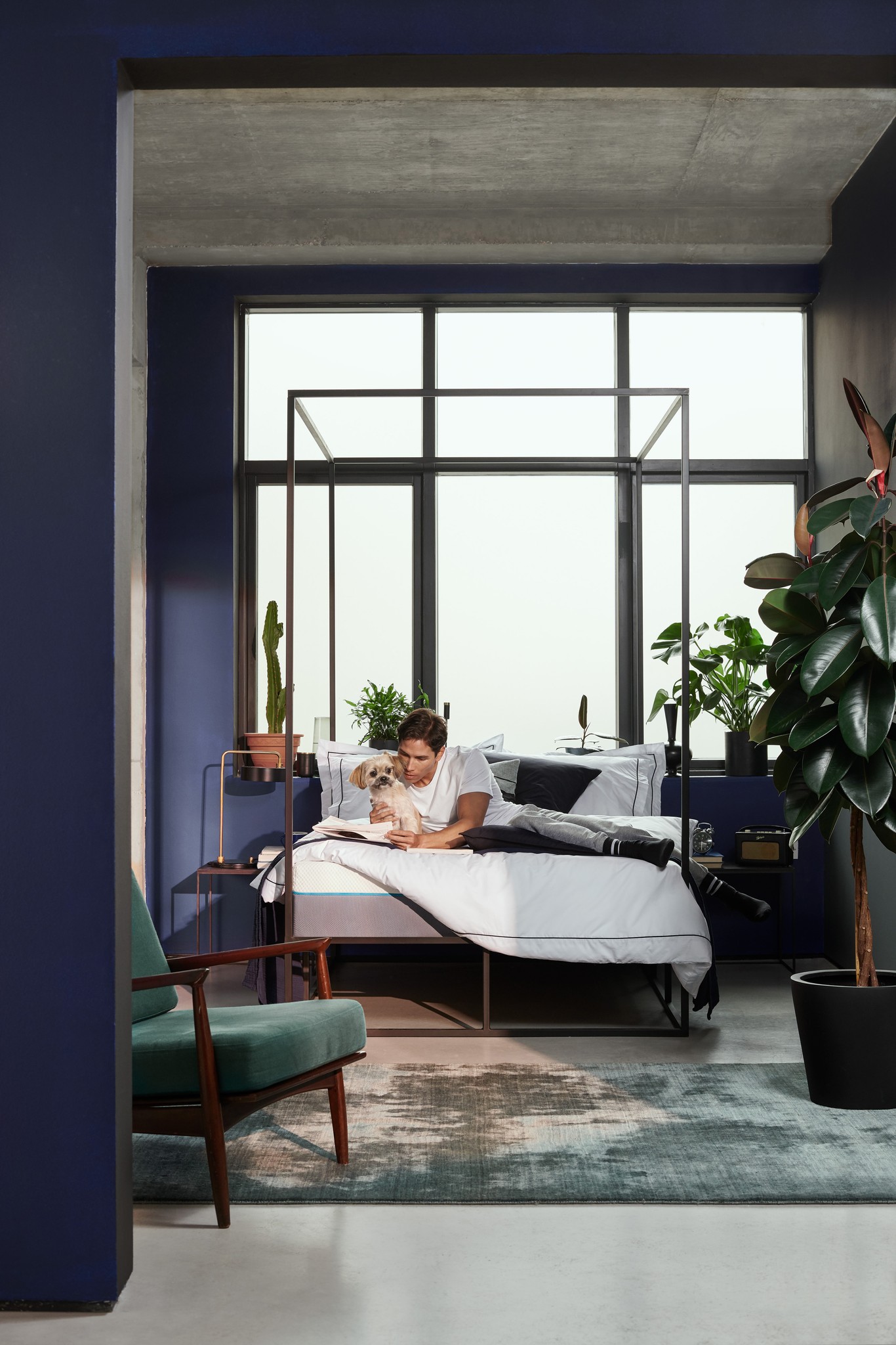
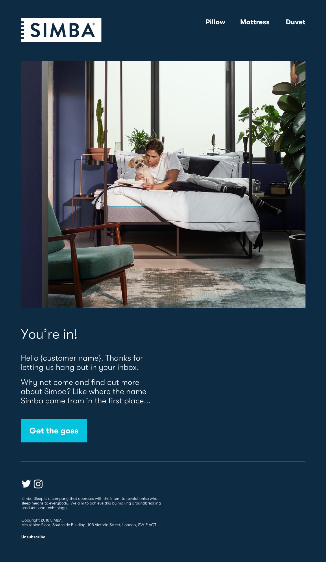
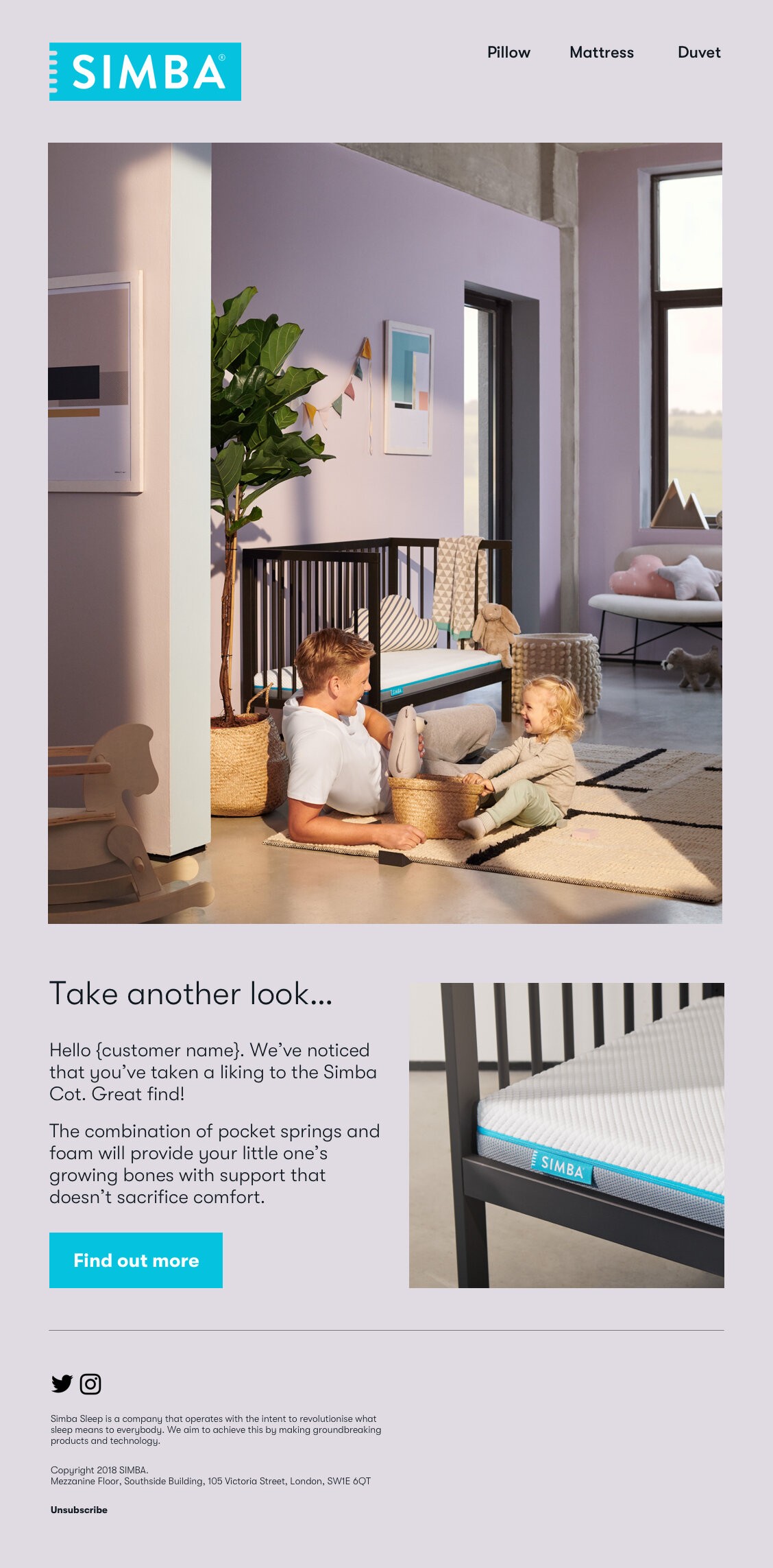
The concept I chose for this photoshoot was 'Morning Light'. We utilised natural morning light to illustrate how you can thrive the day after a good night's sleep. Research indicates that bright white light provides a strong 'daytime' signal to the brain. By incorporating natural, bright daylight, we created a connection to light therapy and the app we were developing. This approach also reinforced Simba's position as an innovative brand and leader in sleep science.
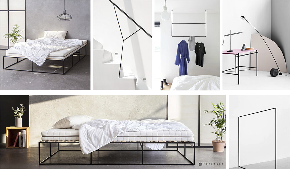
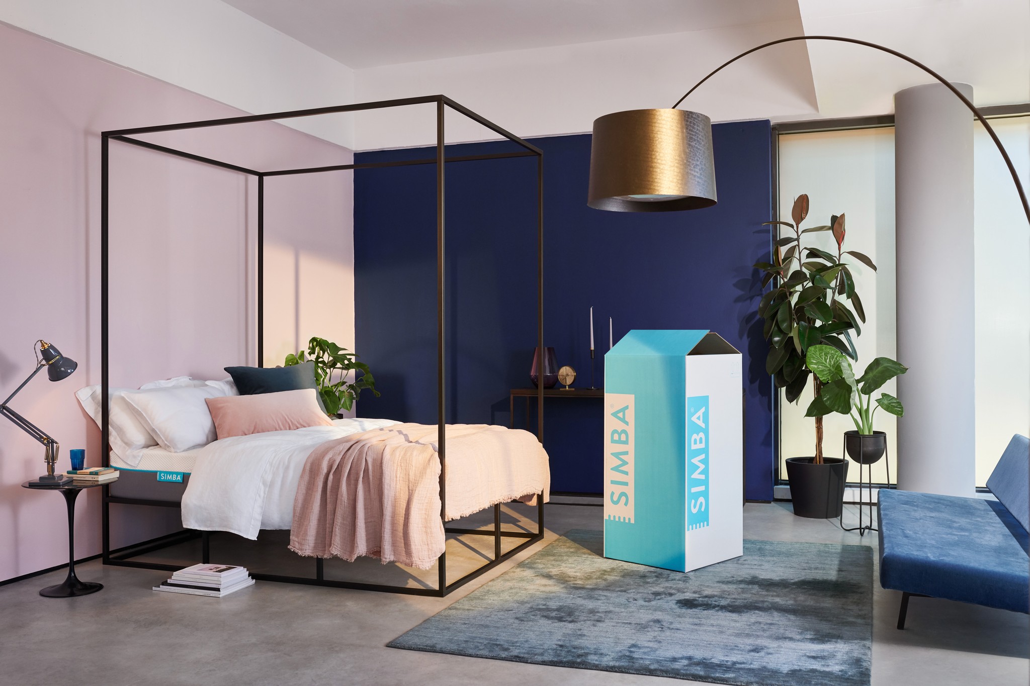
Black frames
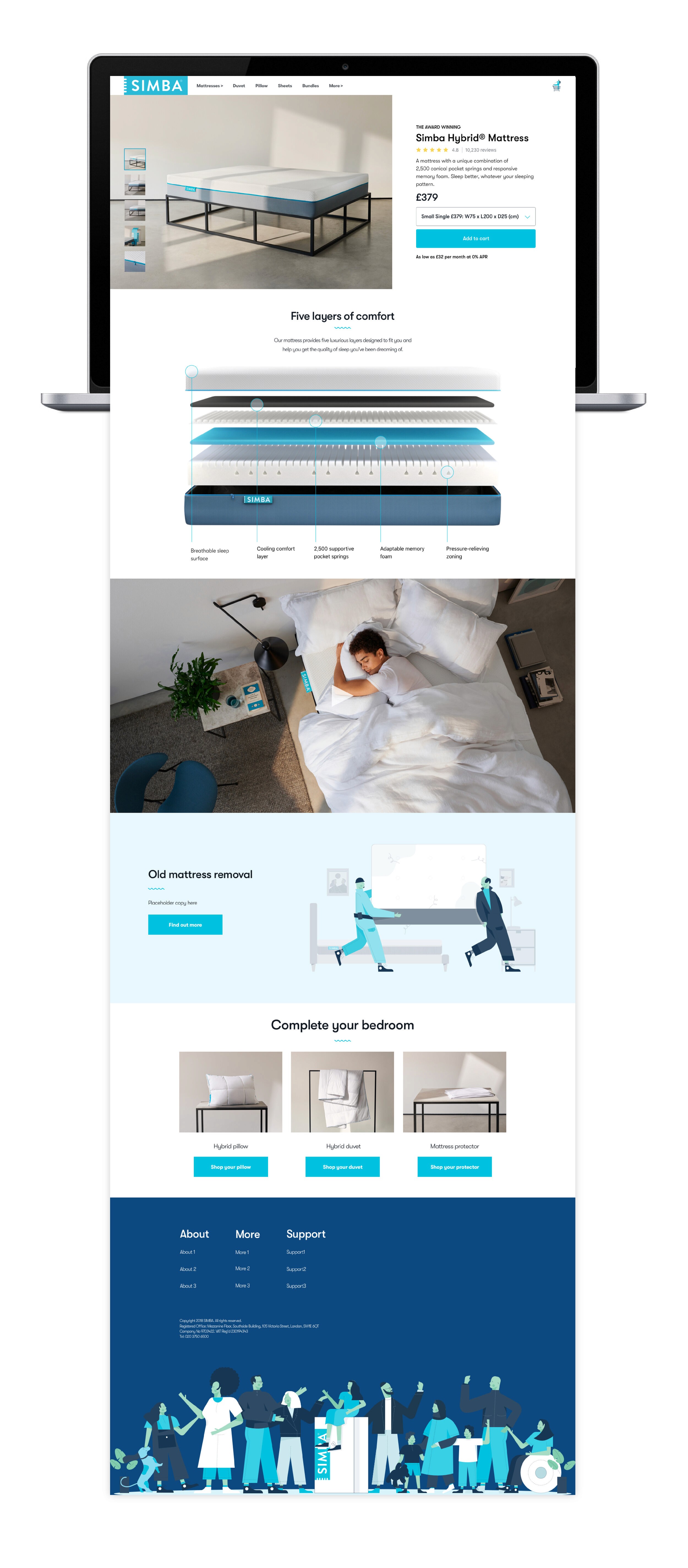
In developing our concept and creative execution, we faced a crucial challenge: showcasing our products effectively without letting them dominate the image or detract from the overall scene.
Simply placing a mattress or pillow on the floor wouldn't suffice, as it fails to present the product in its optimal form. To address this, we chose to use black frames to showcase our products.
Premium aesthetic: Black is a premium color that conveys sophistication.
Neutrality: As a neutral color, black contrasted well with our signature Simba blue.
Relatability: Black is commonly used in home decor, making it easy for consumers to envision our products in their own spaces.
Versatility: This framing design proved adaptable for lifestyle photography as well.
By using this approach, we created a visual presentation that highlighted our products effectively while maintaining the integrity of the overall 'Morning Light' concept. The black frames served as a unifying element across our product range, reinforcing brand consistency while allowing each item to shine in its best light.
Lighting
Conveying natural morning light in all shots was essential to our concept. However, the November shoot date meant we couldn't rely on actual daylight. Sane Seven overcame this challenge using clever lighting techniques. This was crucial in creating a consistent, convincing morning light effect across all images, bringing our 'Morning Light' concept to life despite constraints.
Next project